Often reverently labeled the “ultimate magazine or record of architecture and contemporary design,” the Italian publication domus made history as the spectacular diary of modern and future ideas in design and architecture.
 Beginning in 1928, when legendary Italian designer and Professor of architecture Giovanni (Gio) Ponti presented the first edition. For most of his life, with some interruptions, he would lead and direct the magazine’s fate and style.
The publication was printed at most irregular intervals, sometimes, bi-monthly, then monthly, for some intervals altogether interrupted during WWII, and today appears in 88 countries in a bilingual edition.
 The ‘spirit’ of domus usually is connected with impressions that combine the social meaning of “experiencing” state of the arts residences, as designs, shapes, materials used, colors selected and many other details would shape people’s expectations and satisfaction with such residences, be they small or impressive, practical or complicated to use, serve intellectual, or artistic designs or provide just basic needs of safety and housing.
 Taschen offers the journal’s output of eight decades in seven individual volumes in a new edition – not the entire magazines, but the majority of the original sections. So far, the reprinted titles cover the 1930s, 1940s, 1950s, 1960s and 1970s. While the last two installments, covering 1980-1989 and 1990-1999 will be ready by the end of the year.
 Altogether they offer 4,000+ pages of heavy photo paper with the most fantastic blueprints, sketches, design studies and furniture presented at a time when they were completely avant-garde.
Famous and inventive architects, editors, writers and philosophers, among other staff, created that treasure of ideas, presented the new possibilities of industrial production and design, and visions of the future for modern people and their residences.
 That also very early included urban planning and musings on the future of modern society. The magazine had a strong emphasis on the interrelatedness of the arts, materials, usability and lifestyle, which not necessarily had to be very exclusive or expensive.
Mass production would allow affordable modern furniture in the 1950s. Furthermore, with the magazine’s modern design that would announce its originality with loud and unusual covers, each domus edition was a little piece of art all by itself.
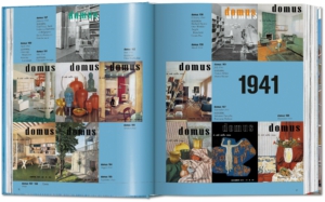
 Apart from brief introductory essays, provided by renowned architects and designers, all original captions and explanatory texts are reproduced in Italian together with an overview of all the magazine’s covers from the respective decade. In the appendix, a complete English translation of that information is waiting.
A useful comprehensive index at the end of each volume provides names of brands, manufacturers, designers, materials, trademark furniture and designs, architects and artists.
As can be expected, not only the changing styles, materials or the outlook on architecture changed gravely.
Furthermore, by comparing roughly the magazine’s output decade by decade, grave difference in presentation, typesetting used, critique, magazine design, and consumption of art as architecture varied strongly, depending on the respective editors-in-chief and those they installed in administration and editorials. And it would alter the magazine’s layout strongly. (The changes in appearance and layout would easily provide data enough for at least one individual design study.) Those names would be, apart from Ponti, famous people such as Italo Lupi, Alberto Moravia, Elio Vittorini, Mario Bellini, Pierre Restany, Cesare Casati, Lisa Licitra Ponti, Vittorio Magnago Lampugnani, Vittoriano Viganò, Paolo Chessa, Ernesto Nathan Rogers, François Burkhardt and many others.
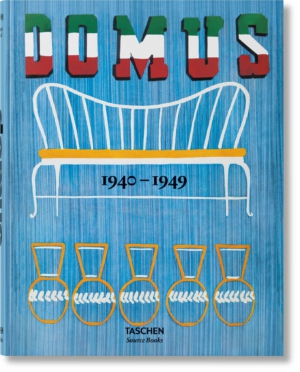
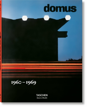 The three volumes presented in this review – 1940-1949, 1950-1959 and 1960-1969 – hint at each decade’s extraordinary visions and ideas. While almost every (monthly) edition had a number of featured architects or designers, domus would also provide regular columns, reports by international correspondents and other sections.
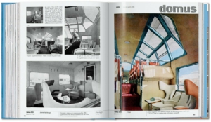
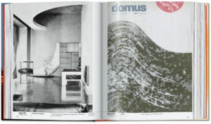
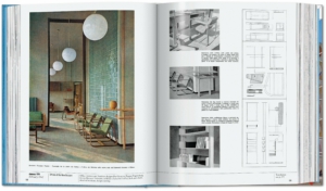
But hardly ever would there be pages without pictures or drawings. The magazine from the start was celebrated for its very visual style, that rather accepted short articles in favor of large-scale photographs.
The early issues of the 1940s generally were informed by “… the isolation of Italian culture from more advanced international developments, due to Fascist foreign policy, and promptly continued with a falling back on autarchic resources and culture, all in a contemporary atmosphere agitated by mounting tensions.”
 While after the war, the magazine would celebrate a liberal Italy, with new raw materials, production modes that were invented during the war and altered industrial designs.
“The year 1948 was a perfect one for the magazine, with its choreography of collaborators who were free spirits above all else. In 1949 Ponti began to insert a list of addresses and telephone numbers at the end of every issue. Divided into categories, they contained the names of the architects, craftspeople, artists and writers who had contributed to the magazine.”
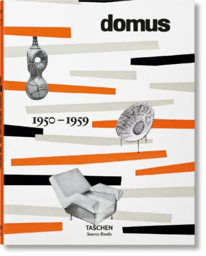
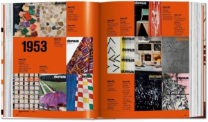
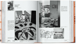
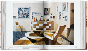
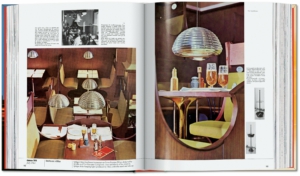 The 1950-1959 volume would find the editors and Italy’s designers in a state of enchantment, as WWII and civil war had ended and the country slowly recovered.
Those were “… the years when domus, and Italy, made an enthusiastic fresh start. The enthusiasm was candid and cosmic, and at that time the fantastic discovery of chaos and the discovery of forms without scale were made”, this recalls Lisa Licitra Ponti, former editor, in her introduction to this volume. Generally, the issues of 1950s domus would present mostly two favorite regions, that were considered most inventive. “Interiors and design during these years were evenly and decisively divided between the American scene and the Nordic countries.”
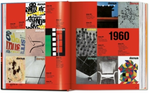
It is even harder, to write a short synopsis on the 1960s and the main topics domus chose then, because way too much happened in terms of architecture and especially furniture design. Pop Art, and its unlimited energy that created new and colorful designs from unusual fabrics and materials may be listed as one message the magazine followed in detail. As with all the issues, the layout and pictures speak for themselves.
Maybe a comment by Deyan Sudjic (domus editor-in-chief in 2000) explains more: In the 1960s, domus “… had a global reach that the English magazines of the time were too timid or too introspective to adopt. It was domus that brought us the first images of Kenzo Tange’s Olympic swimming stadium for the Tokyo games of 1964, as well as the extraordinarily percipient designs of Angelo Mangiarotti. … Looking more deeply at the pages of domus from the 1960s, I realize that they embody one of the problems that has always marked the magazine: the power of the format of the magazine to project a message that is much stronger than the words or images contained within it.”
 No matter what decade in retrospect had to offer the most interesting architectural ideas or futuristic furniture visions, each edition is grand and functions as valuable vault for past lifestyle and design concepts.
As can be expected, there is a whole lot of content and pictures in great reproduction quality, that, as usual for titles edited by design specialists Charlotte & Peter Fiell, also can be measured in sheer weight. As each volume comes as a heavy 4,5 lb book. The same editors have already presented titles on industrial design, collector cars and naturally the Decorative Arts series.
Review by Dr. A. Ebert © 2023
domus 1940–1949. Taschen, Hardcover, 7.7 x 10.0 in., 4.41 lb, English Edition, 640 p., ISBN 978-3-8365-9383-0.
domus 1950–1959. Taschen, Hardcover, 7.7 x 10.0 in., 4.41 lb, English Edition, 640 p., ISBN 978-3-8365-9384-7.
domus 1960–1969. Taschen, Hardcover, 7.7 x 10.0 in., 4.41 lb, English Edition, 640 p., ISBN 978-3-8365-9385-4.